hoto credit: Adobe.
Adobe is in the middle of a design evolution. It saw nimble players like Sketch outflank it in recent times with lightweight tools for agile web and app designers of the mobile and cloud age. But the Titanic of design changed its path in time, recognizing the needs of today’s designers.
It has moved to a subscription-based model with Creative Cloud. A host of new mobile-friendly Adobe apps for specific needs are on the cloud already. But the piece de resistance is the all-in-one tool Adobe Experience Design (XD), which has been on public preview since March.
Be the voice of the customer.
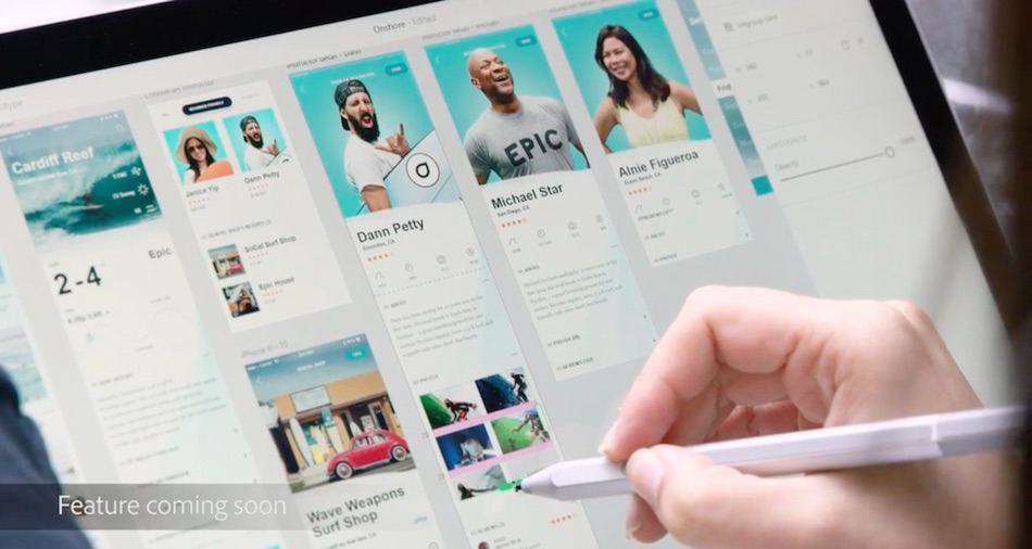
Adobe XD has been built with the needs of user experience (UX) designers in mind. It combines designing with collaboration, prototyping, and testing. The designer can also see the entire user flow, instead of switching between tools or assembling multiple pages or screens in a disjointed way. This should in turn lead to better user experiences on apps and the web.
The Android, iOS, and macOS versions of the tool are out already. Adobe is working with Microsoft for the Windows version.
“XD for Windows will be available at the start of the new year,” Adobe’s VP of design, Jamie Myrold, told a hall full of designers in Bangalore last weekend. She was speaking at a DesignUp event organized by Saif Partners for the benefit of startups, underlining the crucial role design thinking plays at every stage today.
See: Here’s a ranking of 151 enterprise-ready startups from India
Product-centric to user-centric
Jamie, who has led design initiatives at Adobe for over 12 years, gave a glimpse of the thinking that went into the reinvention of Adobe from a “product-centric approach to a customer-centric one.” Earlier, the focus was on specific flagship products like Photoshop and Illustrator, but now the idea is to support a range of tasks end-to-end for the user. Hence, the advent of XD.

hoto credit: Adobe.
Secondly, the thinking has moved from different product versions for different devices to a single version that can run on any surface. This enables cool stuff like automatic synchronization of files across multiple devices as well as easier collaboration or tapping into a community. There’s obviously a trade-off here in terms of device-specific features, but it’s in tune with how things are done. “Today we have horizontal design processes,” explained Jamie.
One of the priorities for Adobe in this evolution has been to maintain its brand identity across multiple products – old and new. How do you make them look like a family? The answer lies in a visual language called Spectrum which is modern, crisp, and can be used across products for a standardized look-and-feel. It has bits of code for buttons, for example, which can be reused.
The trade-off in this web-centric or app-friendly homogeneity is less flexibility for designers, but that’s a good thing, according to Jamie. Why reinvent the wheel when there are more pressing design and business challenges to tackle? The bigger challenge was to introduce new products while the old ones like Photoshop continued to generate the lion’s share of revenue.
See: Here seasoned founders make bulbs flash in the heads of newbies
Tips of wisdom
That brings us to the tips Jamie had for the designers and founders who had turned up to hear her conversation with Jay Dutta, former UX design head of Adobe India who is now a design advisor with Saif Partners. The fundamental shift, said Jamie, is that founders and managers have started to look at design as what happens at the beginning and not the end.
Specifically, she had the following five takeaways for the eager designers who made up a majority of the attendees:
- “Don’t focus on visual elements.” In the cloud and mobile world, the emphasis should be on functionality, not the bells and whistles. Be user-centric, task-oriented, and lightweight.
-
“Be familiar with the customer.” The more designers understand the customer and business, the better will they be at designing the user experience. It comes from interaction and analytics.
-
“Be the voice of the user.” The idea here is to develop so much empathy with the user that the UX speaks in the user’s voice rather than the designer’s. Egotism has to give way to empathy.
-
“Don’t be afraid to challenge founders.” Designers have a great opportunity today to shape business strategy and they should not shy away from it. They have to get involved.
-
“Be kind to designers.” This last tip, delivered tongue-in-cheek, was aimed more at the founders and managers in the audience. “The designer’s voice is the customer’s voice,” Jamie reminded them. It’s the designer steeped in the user experience who can visualize product-market fit.
See: Design thinking for startups: 5 myths about UX busted
This post From Adobe’s design head: 5 tips every designer and founder should know appeared first on Tech in Asia.
from Tech in Asia https://www.techinasia.com/adobe-xd-design-tips
via IFTTT
No comments:
Post a Comment